successfully incorporate orange walls in your home.
You can successfully incorporate orange walls in your design by choosing the right rooms, complementary colors and accessories.
Orange is a vibrant, happy, social color. An orange wall can bring a dynamic energy to any room. It can simultaneously brighten a space while warming it up. Paired with the right colors and accessories, a large swath of orange can make a room really shine. But orange walls haven’t always been an easy sell to homeowners. An orange wall need not look like a giant homage to the citrus fruit; many different hues of this inviting, invigorating color exist in the paint world. Patricia Gray of Patricia Gray Interior Design in Vancouver, British Columbia, has selected three Sherwin-Williams paint colors that she feels illustrate the diversity of orange:
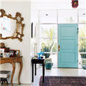
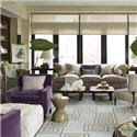
- Husky Orange Sherwin-Williams 6636: "Husky Orange features rusty tones with more brown in it, and I find that this color is a lot more acceptable to a broader range of people. It is one of my favorite colors for using in living rooms, libraries and family rooms."
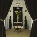
- Tango Sherwin-Williams 6649: "Tango Orange is what I would call more of a mid-range orange, a current and hip color. I would use it for a focal wall in the living room or dining room; it would also be fun for an entryway."
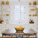
- Kumquat Sherwin-Williams 6648: "Kumquat is beautiful because it tends to go into the peach tones, but it’s an upbeat and livelier tone than what we were inundated with in the ’80s. I find that Kumquat is very relaxing and soothing, which makes it ideal for a bedroom, sitting room or anyplace where you want a quieter mood."
Like any dramatic color used abundantly, orange needs its counterparts.
"White or cream help balance the heat of the color," Gray says.
"Chocolate browns and charcoal grays are also accents that balance and coordinate nicely."

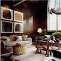
Sherwin-Williams Husky Orange 6636
An example of what might look like on a wall in a living room or family room.
Photo Jeffery Bilhuber


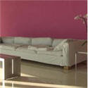
Sherwin-Williams Tango Orange 6649
An example of what Tango Orange might look like on a wall in a dining room. in a dining room.
Photo Antonia Hutt


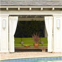
Sherwin-Williams Kumquat Orange 6648
An example of what Kumquat Orange might this color might look like in a kitchen on a backsplash of back painted glass.
The glass gives this color more vibrancy.
Photo Jennifer Gilmer
** Colors may show differently on computer monitors than in real life. I always recommend painting a sample test.
Have you used orange paint in your home?
Do you think that you are likely to use orange in your home in the near future?
If so please let me know about it by leaving a comment.

Read full article at Sherwin-Williams Stir
Read another article on The Color Orange where I give examples of Benjamin Moore Colors.
Patricia Gray writes about 'WHAT'S HOT 'in the world of Interior Design, new and emerging trends, modern design,
architecture, and travel, as well as how your surroundings can influence the world around you.
© Patricia Gray Interior Design Blog, 2009